Fashion Forecasts - Milan Fashion Week
Milan Fashion Week has just wrapped up, and the styles have been as big and as bold as ever. Vogue described the overall feel of “Anger, fear, unease” - as uncertain times are reflected in fashion.

Marni - photo by Alessandro Lucioni
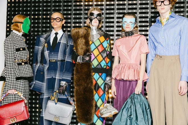
Catwalk shows expressed a (sometimes deliberately) shocking array of experimental styles, pushing the limits of fashion and what it means to be fashionable. So how can you take this and recreate it in your own way?
Gucci - photo by Corey Tenold
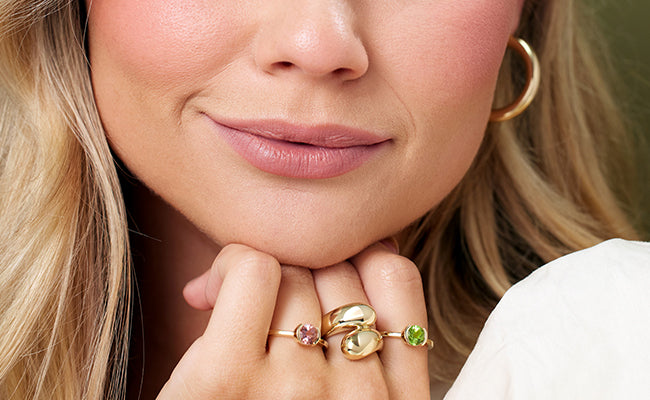
Designers are using layering in a deliberately random manner - so choose your favourites and wear them all! Take that bold handbag and pair it with a loud top and any accessories that speak to you on a given day. To finish off your styling, keep jewellery polished and simple to accentuate rather than create a further clash. Perfect choices for this are Pandora’s Wishbone-inspired collection, and pieces from Najo’s latest launch - Vida. Both of these collections have sleek, polished finishes and geometric designs at their core - perfectly modern and ready to wear with all prints, patterns and designs.


Najo - from the Vida collection
While we are looking at the styles ahead, it’s definitely worth looking into Pantone’s Colour of the Year! This year’s colour is Living Coral, which Pantone describe as “An animating and life-affirming coral hue with a golden undertone that energies and enlivens with a softer edge.”
The contrast between dark, edgy fashion shows and this bright, positive colour is immediately apparent. Perhaps this is because we are endeavouring to remain positive and connect with one another - Leatrice Eiseman puts it well in her statement;
"Colour is an equalising lens through which we experience our natural and digital realities and this is particularly true for Living Coral. With consumers craving human interaction and social connection, the humanising and heartening qualities displayed by the convivial PANTONE Living Coral hit a responsive chord."
Leatrice Eiseman, executive director of the Pantone Colour Institute
We see this positivity pushing through in Pandora’s latest collection of charms, necklaces, rings and bracelets - a reminder to focus on relationships, connections and the good times is key through bright butterflies and colourful blooms, and family and travel-inspired designs (watch this space - pictures coming soon!).
The past few years have seen a surge in many orange, pink and blush hues (the most notable of all, rose gold). Combine pinks and rose gold jewellery with corals for a look that is positive and bright - if the black & studded styles of the runway aren’t really your cup of tea!




Leave a comment
This site is protected by hCaptcha and the hCaptcha Privacy Policy and Terms of Service apply.